Situatie
Solutie
Excel measures the distance between data points in a chart as a percentage. For example, if the gap width is 50%, the space between each column is half the width of the columns themselves.

The key here is to help the reader compare the columns as easily as possible. In other words, if the gap widths are too wide, comparing the data points might be challenging, especially if you remove the gridlines from the chart area. What’s more, overly large spaces between points in the data series look unusual and might lead the reader to think that each bar is unrelated to the others.
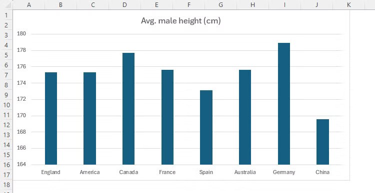
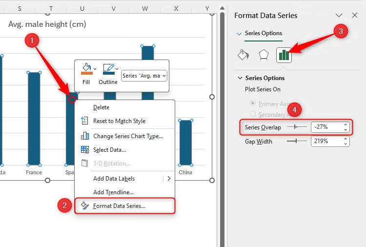
In my version of Excel on Windows, the default gap width is 219%, which means the gaps are over two times the width of the columns. This doesn’t look quite right to me, which is why (depending on the type and quantity of data) I tend to reduce it to around 100%. This means the gaps are the same width as my columns, adding a certain uniformity to my chart.
How to Reduce the Gaps Between Bars and Columns
You can adjust the gap widths in charts where individual data points are plotted separately, like in a column or bar chart. Where data points are connected, like in a line chart, you can’t change the gap width since there is no gap!
So, once you have identified that your data is plotted in the right type of chart, right-click any of the data points, and click “Format Data Series.” Then, in the Format Chart pane, click the chart icon, and either type a new gap width or click and drag the slider.
The chart will update as soon as you make any changes, so you can keep tweaking the gap width value until you’re happy. Note down or remember the gap width you choose, so that you can make sure all your Excel charts are formatted and presented consistently.
Leave A Comment?