Situatie
Pie charts are mostly used as it is more appealing and easy to understand for any type of audience. It is divided into various parts and each part of pie charts denotes a subcategory of the original data set. This sub-category data is sometimes shown using the original values or sometimes using percentages as each subcategory represents the proportion of data.
Solutie
Pasi de urmat
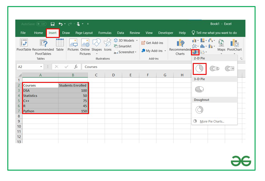
Consider the data set which consists of information about the number of students enrolled in our courses.

The steps are as follows :
- Insert the data set in the form of a table as shown above in the cells of the Excel sheet.
- Select the data set and go to the Insert tab at the top of the Excel window.
- Now, select Insert Doughnut or Pie chart. A drop-down will appear.
- Select a 2-D pie chart from the drop-down. A pie chart will be built.

Select -> Insert -> Doughnut or Pie Chart -> 2-D Pie
Initially, the pie chart will not have any data labels in it. To add data labels, select the chart and then click on the “+” button in the top right corner of the pie chart and check the Data Labels button.

It can be observed that the pie chart contains the value in the labels but our aim is to show the data labels in terms of percentage. Show percentage in a pie chart:
The steps are as follows :
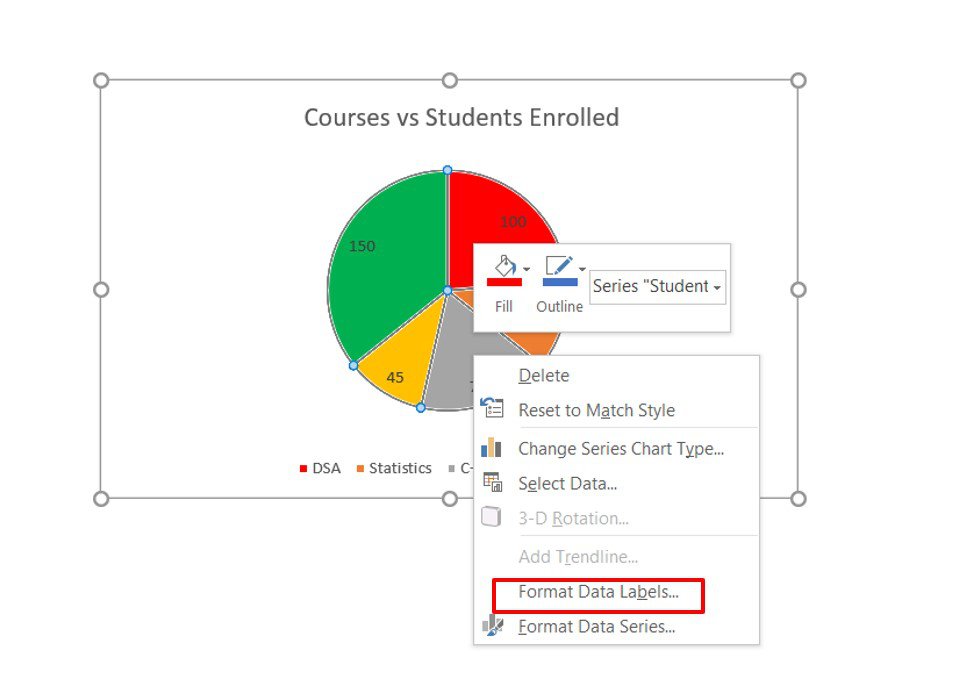
- Select the pie chart.
- Right-click on it. A pop-down menu will appear.
- Click on the Format Data Labels option.

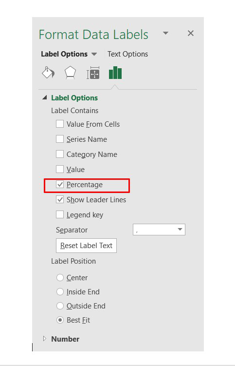
- The Format Data Labels dialog box will appear.
- In this dialog box check the “Percentage” button and uncheck the Value button. This will replace the data labels in pie chart from values to percentage.


Leave A Comment?