Situatie
You might have heard the idiom about the guy with his feet in a freezer and his head in an oven: on average, he’s perfectly comfortable. In Excel, we do this with our data every day. Averages are great summaries, but they can quietly sabotage your decisions.
Solutie
Pasi de urmat
A dynamic tracker keeps the most important metrics front and center
Add a “reliability dashboard” to your worksheet
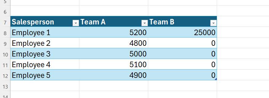
Suppose you’re tracking the performance of two sales teams in an Excel table named T Totals. Team A is remarkably consistent, while Team B relies on a single superstar to carry the rest of the group.
When you calculate the average, the two teams appear to perform similarly, but this hides huge differences in individual performances. That’s why we need to introduce some simple guardrail measures to the spreadsheet—tools that show how reliable each average really is.
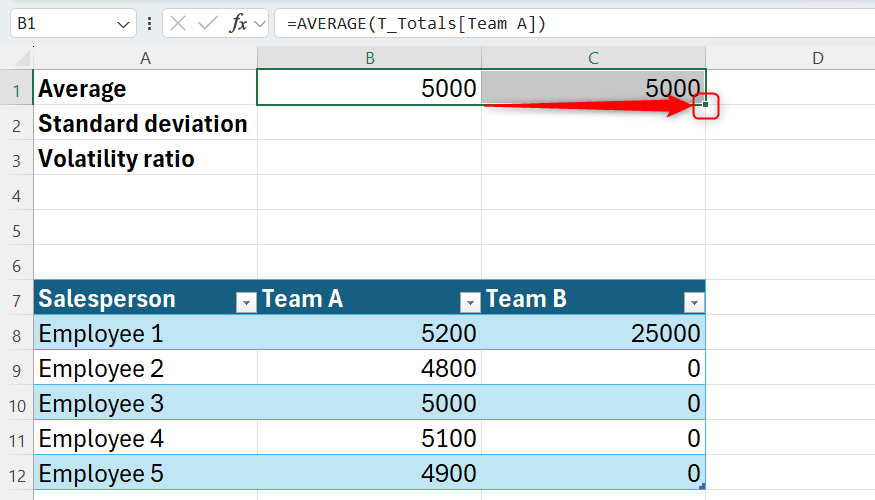
Begin with the AVERAGE function in B1 to find Team A’s mean score:
=AVERAGE(T_Totals[Team A])
and drag the formula across to cell C1 for Team B.
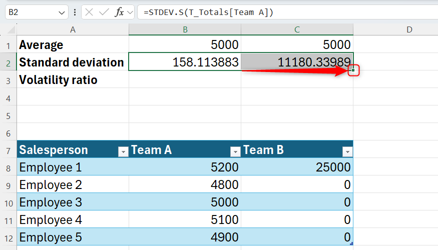
Now, calculate the standard deviation for Team A in cell B2 using the STDEV.S function:
=STDEV.S(T_Totals[Team A])
and drag this second formula across to cell C2 for Team B.
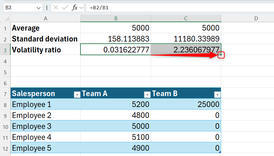
Next, calculate the volatility ratio for Team A in cell B3 using:
=B2/B1
and drag it to cell C3 for Team B.
Finally, set the results in cells B1:C2 to two decimal places and format cells B3:C3 as percentages—using the icons in the Number group of the Home tab—to tidy up your reliability dashboard.
![]()
Identical averages often hide polar opposites in your data
Use the volatility ratio as a reliability score
When you review your averages, both teams are at 5,000. Without further analysis, you might assume they’re performing at the same level. However, the standard deviation and volatility ratio (scientifically known as the coefficient of variation) tell a different story:
- Team A (consistent): Has a deviation of only 158.11. This represents the typical distance each salesperson sits from that 5,000 center—because it’s small, it tells you that almost everyone is selling close to the average. With a volatility ratio of 3%, this average is highly reliable.
- Team B (inconsistent): Has a staggering deviation of 11,180.34. This indicates that the average is a mathematical fluke driven by a single outlier, rather than a reflection of typical performance. Its volatility ratio is 224%, meaning the average is unreliable.
This is outlier sensitivity—how one massive number pulls the average away from what is typical. These thresholds aren’t hard statistical laws, but they’re practical guardrails for your dashboards:
- 0%-15% (low variance): The average is an excellent representation of the data.
- 16%-50% (moderate variance): The average is useful, but the spread is wide enough that outliers might be present.
- 51%+ (high variance): The average is statistically “noisy” and potentially misleading. You should use the median to find the true middle instead.
The fix: Swap your formulas for more reliable logic
Use the median or trimmed mean for high-variance data
If your volatility is in the “high variance” zone (over 50%), you should stop relying on =AVERAGE alone. To find a more honest middle ground, use these two methods.
Method 1: Find the median
The MEDIAN function focuses on the middle value, so extreme outliers don’t skew the result. You can add this as a new row in your dashboard. In cell A4, type Median, and in cell B4, type:
=MEDIAN(T_Totals[Team A])
and drag it across.
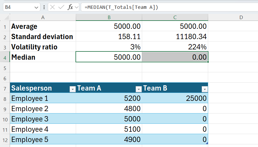
For team B, the average suggests solid performance at 5,000, but the median is 0. This is a much more accurate reflection of a team where four out of five people sold nothing. The fact that the average and median for Team A are identical tells you that this team’s data is consistent and reliable.
Method 2: Use the standard trimmed mean
If you have a large dataset (at least dozens or hundreds of rows) and want to ignore the top and bottom freak results, use TRIMMEAN:
=TRIMMEAN(T_Totals[Team A],0.2)
A common choice is 0.2—it tells Excel to remove 20% of the data points total (10% from the top and 10% from the bottom), preventing outliers from dragging your average away from reality. However, it won’t work for our five-row dataset—with so few points, Excel doesn’t have enough data to remove the extremities without losing the entire set. Save this method for your largest, messiest spreadsheets.
When is the average actually safe?
I’m not telling you to stop using AVERAGE completely. You can trust a mean when:
- Uniformity is high: Your volatility ratio is under 10%.
- You have large sample sizes: Thousands of rows diminish the impact of a single outlier.
- You use controlled processes: Environments designed to eliminate variance, like a factory line or standard testing, make the average highly stable.
Stop trusting a number just because it looks clean. A spreadsheet that only shows averages recreates the freezer-and-oven problem in digital form. By adding standard deviation and a volatility ratio to your spreadsheets, you’re building an early-warning system that tells you exactly when to trust your data.
Leave A Comment?