Situatie
XlsxWriter is a Python library using which one can perform multiple operations on excel files like creating, writing, arithmetic operations and plotting graphs. Let’s see how to plot different types of pie charts using realtime data. Charts are composed of at least one series of one or more data points. Series themselves are comprised of references to cell ranges.
For plotting the charts on an excel sheet, firstly, create chart object of specific chart type( i.e Pie chart etc.). After creating chart objects, insert data in it and lastly, add that chart object in the sheet object. For plotting the simple Pie chart on an excel sheet, use add_chart() method with type ‘pie’ keyword argument of a workbook object.
Solutie
# import xlsxwriter module
import xlsxwriter
# Workbook() takes one, non-optional, argument
# which is the filename that we want to create.
workbook = xlsxwriter.Workbook(‘chart_pie.xlsx’)
# The workbook object is then used to add new
# worksheet via the add_worksheet() method.
worksheet = workbook.add_worksheet()
# Create a new Format object to formats cells
# in worksheets using add_format() method .
# here we create bold format object .
bold = workbook.add_format({‘bold’: 1})
# create a data list .
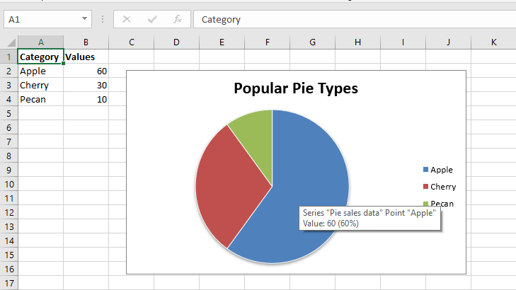
headings = [‘Category’, ‘Values’]
data = [
[‘Apple’, ‘Cherry’, ‘Pecan’],
[60, 30, 10],
]
# Write a row of data starting from ‘A1’
# with bold format.
worksheet.write_row(‘A1’, headings, bold)
# Write a column of data starting from
# A2, B2, C2 respectively.
worksheet.write_column(‘A2’, data[0])
worksheet.write_column(‘B2’, data[1])
# Create a chart object that can be added
# to a worksheet using add_chart() method.
# here we create a pie chart object .
chart1 = workbook.add_chart({‘type’: ‘pie’})
# Add a data series to a chart
# using add_series method.
# Configure the first series.
#[sheetname, first_row, first_col, last_row, last_col].
chart1.add_series({
‘name’: ‘Pie sales data’,
‘categories’: [‘Sheet1’, 1, 0, 3, 0],
‘values’: [‘Sheet1’, 1, 1, 3, 1],
})
# Add a chart title
chart1.set_title({‘name’: ‘Popular Pie Types’})
# Set an Excel chart style. Colors with white outline and shadow.
chart1.set_style(10)
# Insert the chart into the worksheet(with an offset).
# the top-left corner of a chart is anchored to cell C2.
worksheet.insert_chart(‘C2’, chart1, {‘x_offset’: 25, ‘y_offset’: 10})
# Finally, close the Excel file
# via the close() method.
workbook.close()
Leave A Comment?