Situatie
Solutie
The simplest form of regression in Python is, well, simple linear regression. With simple linear regression, you’re trying to see if there’s a relationship between two variables, with the first known as the “independent variable” and the latter the “dependent variable.” The independent variable is typically plotted on the x-axis and the dependent variable on the y-axis. This creates the classic scatterplot of data points. The objective is to plot a line that best fits this scatterplot.
We’ll start by using the example data of tips in New York City restaurants. We want to see if there’s a relationship between the total bill and the tip. This dataset is included in the Seaborn statistical plotting package, my favorite data visualization tool. I’ve set these tools up in a Mamba environment for easy access.
First, we’ll import Seaborn, a statistical plotting database.
import seaborn as snsThen we’ll load in the dataset:
tips = sns.load_dataset('tips')If you’re using a Jupyter notebook, like the one I’m linking to on my own GitHub page, be sure to include this line to have images display in the notebook instead of an external window:
%matplotlib inlineNow we’ll look at the scatterplot with the relplot method:
sns.relplot(x='total_bill',y='tip',data=tips)

sns.regplot(x='total_bill',y='tip',data=tips)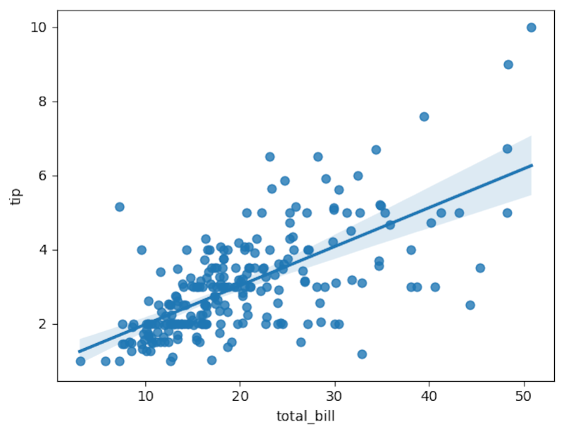
The line does seem to fit pretty well.
We can use another library, Pingouin, for more formal analysis. Pingouin’s linear_regression method will calculate the coefficients for the regression equation of the line to fit over the datapoints and determine the fit.
import pingouin as pg
pg.linear_regression(tips['total_bill'],tips['tip']).round(2)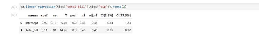
The rounding will make the results easier to read. The number to pay attention to in linear regression is the correlation coefficient. In the resulting table, it’s listed as “r2” since it’s the square of the correlation coefficient. It’s .46, which indicates a good fit. Taking the square root reveals that it’s around .68, which is pretty close to 1, indicating a positive linear relationship more formally than the plot we saw earlier.
We can also build a model with the values in the table. You might remember the equation of a line: y = mx + b. The y would be the dependent variable, the m is the coefficient of x, or the total bill, which is .11. This determines how steep the line is. The b is the y-intercept, or 0.92.
tip = 0.11(total bill) + 0.92The equations for regression flip this around, so it would be:
tip = 0.92 + 0.11(total_bill)We can write a short Python function that predicts the tip based on the amount of the bill.
def tip(total_bill):
    return 0.92 + 0.11 * total_bill
Let’s predict the tip from a $100 restaurant bill:
tip(100)
The expected tip is around $12.
Multiple Linear Regression: Taking Regression into the Third Dimension, And Beyond
Linear regression can be extended to more variables than just two. You can look at more independent variables. Instead of fitting a line over data points on a plane, you’re fitting a plane over a scatterplot. Unfortunately, this is harder to visualize than with a 2D regression. I used multiple regression to build a model of laptop prices based on their specs.
We’ll use the tips dataset. This time, we’ll look at the size of the party with the “size” column. It’s easy to do in Pingouin.
pg.linear_regression(tips[['total_bill','size']],tips['tip']).round(2)
Note the double brackets on the first argument specifying the total bill and the size of the party. Notice that the r² is identical. This again means that there’s a good fit and that the total bill and the table size are good predictors of the tip.
We can rewrite our earlier model to account for size, using the coefficient of the table size:
def tip(total_bill,size):

return 0.67 + 0.09 * total_bill + 0.19 * size
Nonlinear Regression: Fitting Curves
Not only can you fit linear regression, but you can also fit nonlinear curves. I’ll demonstrate this using NumPy to generate some data points that can represent a quadratic plot.
First, I’ll generate a large array of datapoints in NumPy for the x-axis:
x = np.linspace(-100,100,1000)
Now I’ll create a quadratic plot for the y-axis.
y = 4*x**2 + 2*x + 3import pandas as pd
df = pd.DataFrame({'x':x,'y':y})We can examine our DataFrame with the head method:
df.head()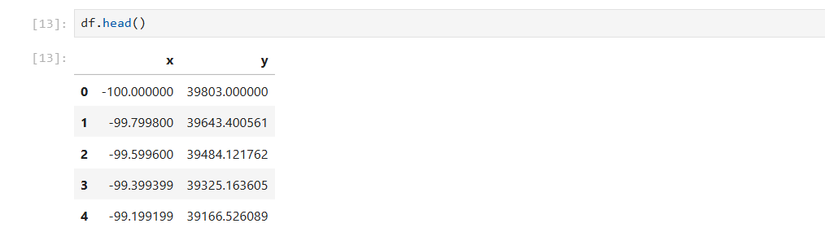
We can create a scatterplot with Seaborn as we did earlier with the linear data:
sns.relplot(x='x',y='y',data=df)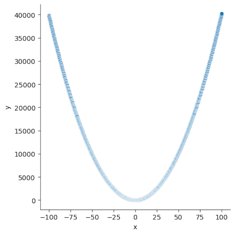
It looks like the classic parabolic plot you might remember from math class, plotting on your graphing calculator (which Python can replace). Let’s see if we can fit a parabola over it. Seaborn’s regplot method has the order option, which specifies the degree of the polynomial line to fit. Since we’re trying to plot a quadratic line, we’ll set the order to 2:
sns.regplot(x='x',y='y',order=2,data=df)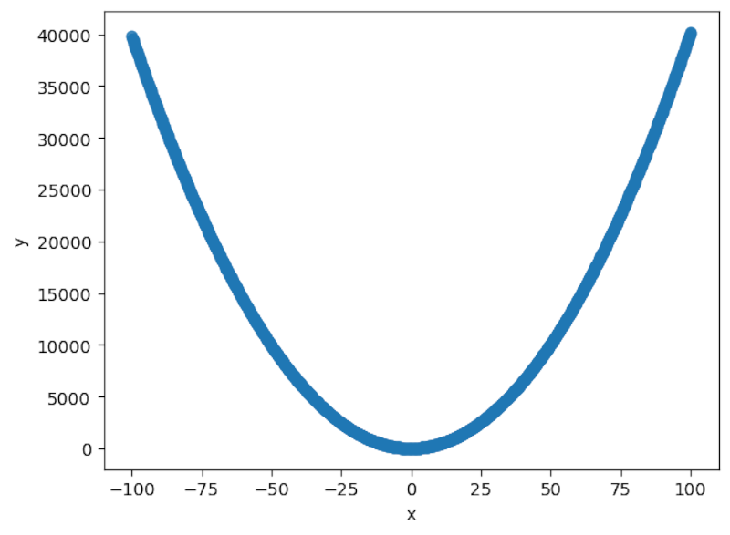
It does indeed seem to fit a classic quadratic parabola.
df['x2'] = df['x']**2We can then use linear regression to fit the quadratic curve:
pg.linear_regression(df[['x','x2']],df['y']).round(2)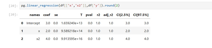
Because this was an artificial creation, the r² is 1, indicating a very good fit, one that you probably wouldn’t see on real-life data.
We can also build a predictive model using a function:
def quad(x):
    return 3 + 2*x + 4*x**2
You can also extend this method to polynomials with degrees higher than 2.
Logistic Regression: Fitting Binary Categories
If you want to find a relationship for binary categories, such as a certain risk factor, like whether a person smokes or not, we can use logistic regression.
The easiest way to visualize this is once again using the Seaborn library. We’ll load the dataset of passengers on the Titanic. We want to see if ticket price was a predictor of who would survive the ill-fated journey or not.
titanic = sns.load_dataset('titanic')We can examine the data the way we did with the quadratic DataFrame:
titanic.head()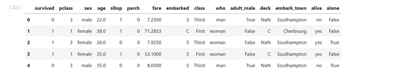
We’ll use the lmplot method, since it can fit a logistic curve:
sns.lmplot(x='fare',y='survived',logistic=True,data=titanic)
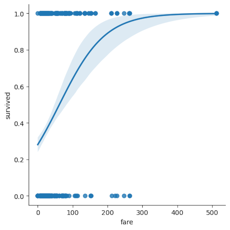
We see the logistic curve over the number of passengers, separated by whether they survived or not. The “survived” column is already separated into 0 for “didn’t survive” and 1 for “survived.”
We can use Pingouin to determine formally if the fare price was a predictor of survival on the Titanic, using Pingouin, which, among its many statistical tests, offers logistic regression:
pg.logistic_regression(titanic['fare'],titanic['survived']).round(2)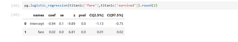
Leave A Comment?