Situatie
Solutie
Work More Efficiently With the COPILOT Function
| Prerequisites | You must have a Copilot license to use this new function. Copilot licenses come as standard with Microsoft 365 subscriptions, unless you downgrade your Microsoft account before the next billing date. |
|---|---|
| Availability | The COPILOT function is currently in preview with members of the Microsoft Insider program on Windows version 2509 (Build 19212.20000) or later, and Mac version 16.101 (Build 25081334) or later. It will also be rolling out to Insiders using Excel for the web soon. It is expected to become generally available to those using Excel for Windows, Mac, and the web in the coming months. |
The new COPILOT function is an inevitable Microsoft Excel development, given the tech giant’s continued focus on integrating AI into its productivity suite. According to Microsoft, the COPILOT function “brings the power of large language models directly into the grid and makes it easier than ever to analyze text, generate content, and work faster”.
Here’s the syntax for the COPILOT function:
=COPILOT(prompt¹, [context¹], [prompt²], [context²], ...)
where each prompt argument is the natural language prompt (a question or a task) inside double quotation marks, and each context argument is a reference to a single cell, a range of cells, an Excel table, or a named range that tells Copilot where to find the data it’s going to use.
In this example, imagine you’ve imported feedback from Microsoft Forms about a new coffee machine you installed in the office.
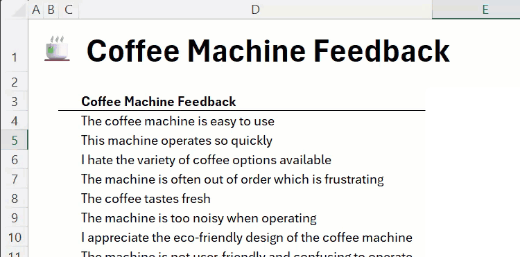
Rather than read and summarize this data manually, you can make the COPILOT function do this for you. In cell E4, type:
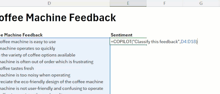
=COPILOT("Classify this feedback",D4:D18)
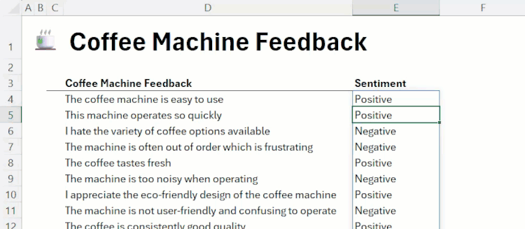
When you press Enter, after analyzing your data for a few seconds, Copilot will return results similar to those in the following screenshot:
You can also nest the COPILOT function inside other Excel functions—such as IF, SWITCH, or WRAPROWS—to integrate AI into your spreadsheet without changing its layout.
Here, typing:
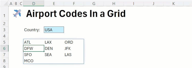
=WRAPROWS(COPILOT("List airport codes from major airports in",E3),3,"")
produces a list of major airports according to the selected country in E3 in three columns, rather than one.
Microsoft warns that the COPILOT function “uses AI and can give incorrect responses.” It also advises you to avoid using this new function “for any task requiring accuracy or reproducibility,” advising you to use “native Excel [functions]” in these contexts instead.
Use Copilot to understand how formulas work
| Prerequisites | As with all Copilot features, you need to have a license to access this functionality. |
|---|---|
| Availability | This feature is gradually rolling out to Excel for Windows and Excel for the web. There’s no word from Microsoft on whether and when it’ll be available to those using Excel for Mac. |
Understanding how formulas work in Excel is critical when reviewing a spreadsheet for errors, or if you want to reuse a formula elsewhere. However, if you encounter a complex formula, breaking it down can be challenging, especially if it was created by someone else or generated using Copilot. That’s why Microsoft has introduced the new Explain Formula feature, which leverages AI to give step-by-step explanations of the inner workings of the formulas in your workbook.
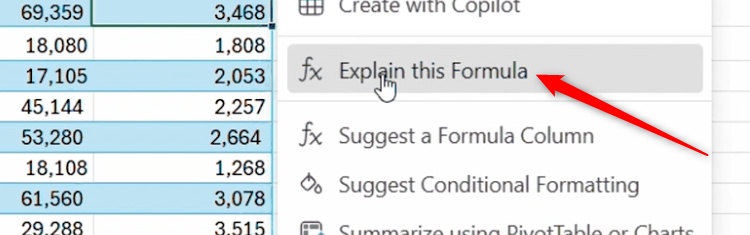
Then, in the drop-down menu, click “Explain This Formula”
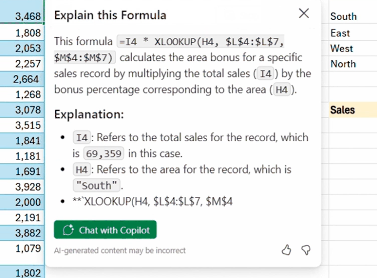
If the Copilot pane is already open, the explanation will appear there instead. So, to make the most of the Explain Formula feature in the Excel grid, close the Copilot pane before you activate it.
Analyze and Manipulate Images with Python
| Prerequisites | Python in Excel is available to those with a Microsoft 365 consumer, commercial, or education subscription, and Microsoft 365 connected experiences must also be enabled. You need at least a foundational understanding of Python to use this tool. |
|---|---|
| Availability | Insiders using Excel for Windows version 2509 (Build 19204.20002) or later, or Excel for Mac version 16.101 (Build 25080524) or later, can access this new image-based Python functionality. As with most features in the testing phase, Microsoft will likely roll out Python image analysis to everyone else once any issues have been ironed out. |
As with Copilot, Python in Excel unlocks a whole host of new possibilities. In this update, it can be used to analyze, manipulate, and gather important information from in-cell images.
Python image analysis only works when an image is inserted within a single cell, not on top of cells. One way to do this is using the IMAGE function.
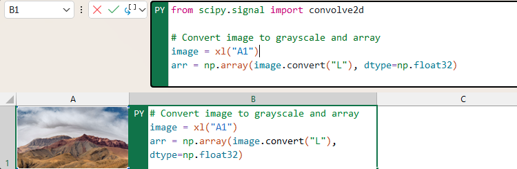
Imagine you’ve inserted an image into cell A1, and you want Python to analyze whether the image is blurry or sharp.
To do this, first, type:
=PY(
from PIL import Image
import numpy as np
from scipy.signal import convolve2d
# Convert image to grayscale and array
image = xl("A1")
arr = np.array(image.convert("L"), dtype=np.float32)
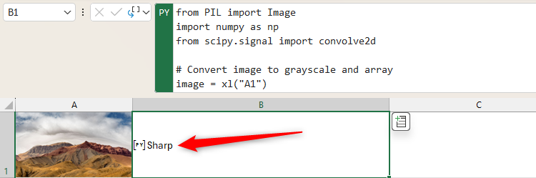
# Apply Laplacian filter
laplacian = convolve2d(arr, [[0, 1, 0], [1, -4, 1], [0, 1, 0]], mode='same', boundary='symm')
# Classify based on variance
"Blurry" if np.var(laplacian) < 100 else "Sharp"
When you press Ctrl+Enter to run the code, you’ll see either “Blurry” or “Sharp” appear in the cell.
You can also use Python in Excel to adjust an image’s brightness, change its color, insert a watermark, and execute various other image manipulation actions. On the other hand, you could use it to analyze image metadata, or produce 3D graphs to visualize a picture’s structure and composition.
Add Fountain and Brush Pen Annotations to Your Worksheet via the Draw Tab
Drawing tools have been available in Microsoft Excel for some time, but the options were limited to basic pens or highlighters. With this update, however, you can now add fountain and brush pen annotations, just like in OneNote for Windows.
Open the “Draw” tab on the Excel ribbon, and alongside the existing drawing tools, you’ll see Fountain and Brush (hover over the tools to see what type of pen they are).
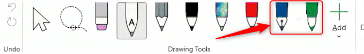
You might notice that the Drawing Tools group of the Draw tab is a bit overcrowded with these new additions, which is why, as part of the same update, Microsoft has added the ability to add, remove, and reorder the pens. Simply click, hold, and drag a tool to move it to the left or right, or right-click one to delete it.
| Prerequisites | The only prerequisite for using Excel for the web is that you need to have signed up for a free Microsoft account. |
|---|---|
| Availability | This functionality was already available in Excel for Windows, and this update extends it to Excel for the web. There’s currently no suggestion from Microsoft that it will be rolled out to Excel for Mac. |
When you insert a chart into a worksheet in Excel for the web, you can display data labels—small text boxes that sit next to a data point to provide specific information—via the Chart tab on the ribbon.
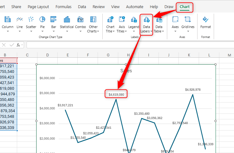
However, in the example above, the lengthy data labels overlap and look untidy, so let’s say you want to represent millions using the letter “M.” It’s been possible to do this in Excel for Windows for some time, but now, you can also do it in Excel for the web.
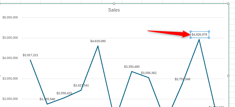
Now, right-click the isolated data label, and click “Edit Text”
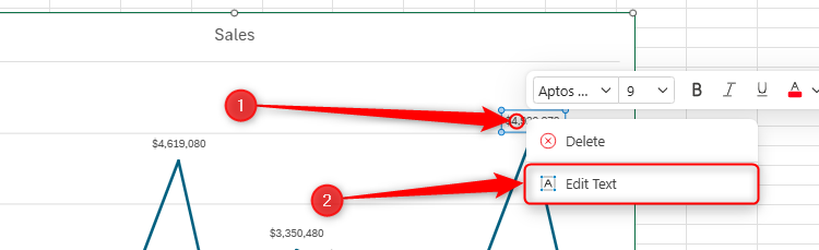
Finally, define the new data label text, and click “OK”
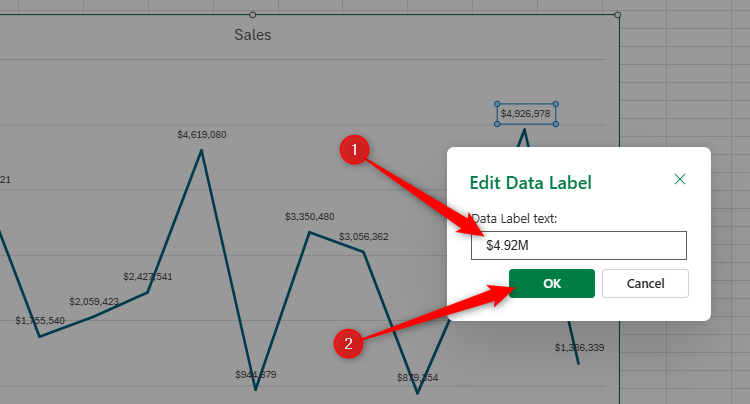
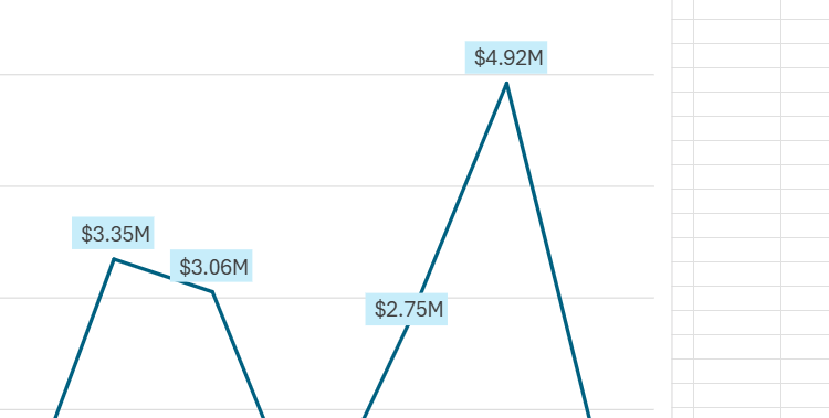
Now, the data label looks tidier, and you can repeat the process for the others, as well as make any additional formatting adjustments.
When you edit a data label that is linked to a value in a chart, you will disconnect that link, meaning the data label won’t update if the source data changes. To reestablish the link, first, click “Data Labels” in the Chart tab on the ribbon, and select “None” to remove them. Then, re-add fresh labels by clicking “Data Labels” again, and choosing the relevant positioning.
Leave A Comment?