Situatie
Flexible Box Module or Flexbox is a type of layout model. The main aim of this layout is to distribute space between items in a container. This layout is a one-dimensional layout model. The flexbox layout even works when the size of the items is unknown or dynamic. We can use the justify-content property of a flex container to set space between the flexbox.
Solutie
Syntax:
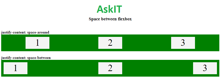
- The value space-between is used for displaying flex items with space between the lines.
justify-content: space-between;
- The value space-around is used for displaying flex items with space between, before and after the lines.
justify-content: space-around;
The below example will illustrate the property used for setting space between the flexbox.
Example:
<!DOCTYPE html>
<html>
<head>
<title>Space between flexbox</title>
<style>
.flex2 {
display: flex;
justify-content: space-around;
background-color: green;
}
.flex3 {
display: flex;
justify-content: space-between;
background-color: green;
}
.flex-items {
background-color: #f4f4f4;
width: 100px;
height:50px;
margin: 10px;
text-align: center;
font-size: 40px;
}
h3 {
text-align:center;
}
.AskIT {
font-size:40px;
text-align:center;
color:#009900;
font-weight:bold;
}
</style>
</head>
<body>
<div class = “AskIT”>AskIT</div>
<h3>Space between flexbox</h3>
<br>
<b>justify-content: space-around </b>
<div class=”flex2″>
<div class=”flex-items”>1</div>
<div class=”flex-items”>2</div>
<div class=”flex-items”>3</div>
</div>
<br>
<b>justify-content: space-between </b>
<div class=”flex3″>
<div class=”flex-items”>1</div>
<div class=”flex-items”>2</div>
<div class=”flex-items”>3</div>
</div>
<br>
</body>
</html>
Leave A Comment?