Situatie
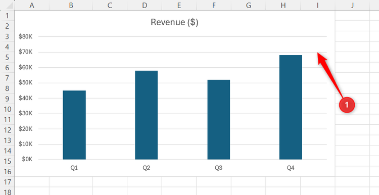
Excel’s default charts often make data harder to read, with distracting gridlines, awkward spacing, and attention-grabbing colors. That’s why I have a quick cleanup routine to transform basic charts into more professional-looking visuals in minutes.
Solutie
Pasi de urmat
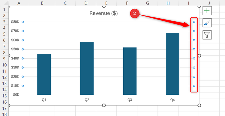
Remove the default gridlines to declutter the canvas
Excel automatically inserts thin gray horizontal lines across the background of many column and bar charts. For charts where precise value comparisons matter, light gridlines can still be useful. But for most presentation charts, removing them improves clarity and eliminates visual noise that competes with the data points.
To clear this background clutter:
- Select any one of the horizontal gridlines inside the chart.
- Verify that small selection bubbles appear on the tips of all the lines.
- Press Delete.
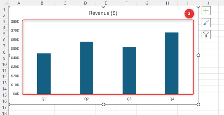
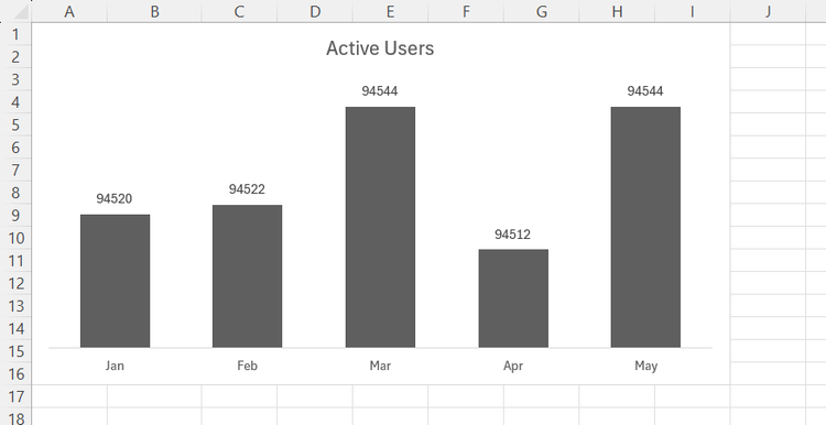
Removing these lines instantly creates a simplified canvas that lets your actual columns take center stage.
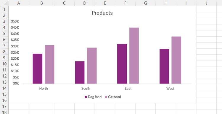
Limit your palette to a few contrasting tones
The bright primary chart colors that Excel assigns by default can easily distract from the actual story you’re trying to tell. Instead of manually recoloring individual columns or changing your workbook’s theme, you can apply a different color palette directly to the chart itself. I prefer to use a limited, consistent palette with strong contrast to draw the eye exactly where it needs to go.
To adjust your chart colors using Excel’s built-in palettes:
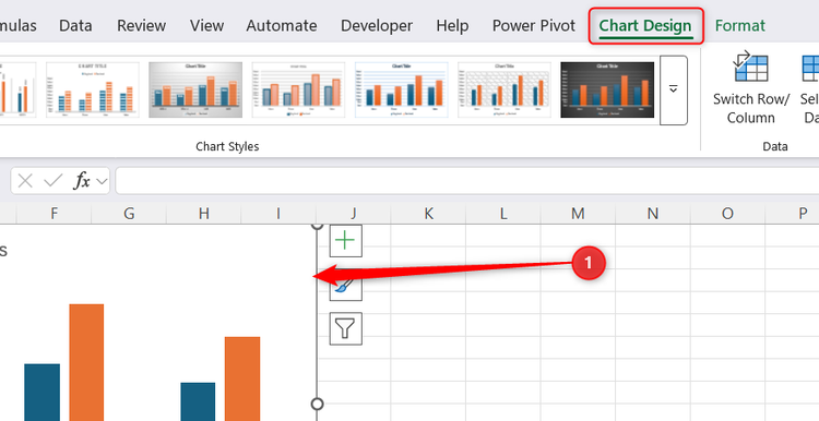
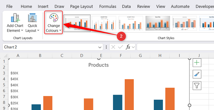
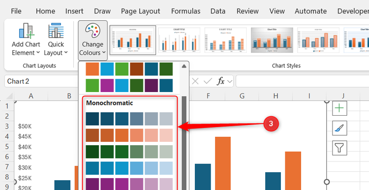
- Click your chart once to reveal the contextual Chart Design tab on the ribbon
- In that tab, click Change Colors.
- For a cleaner look, select a palette featuring muted, contrasting tones that make the data pop without looking overly busy. A monochromatic palette can also improve accessibility, since differences in lightness are often easier to distinguish than relying on multiple competing hues.
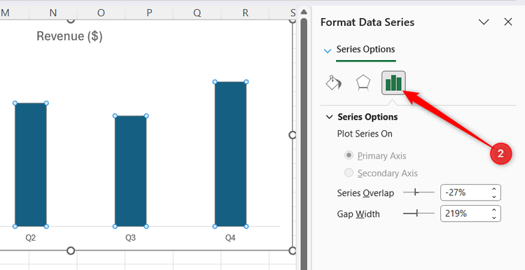
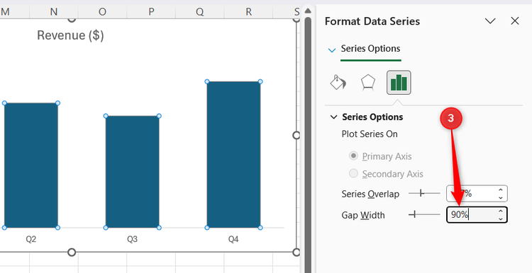
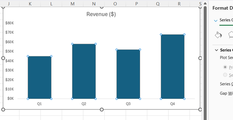
Adjust column geometry to minimize dead space
By default, Excel columns are thin and are separated by more whitespace than most charts need. This can make the chart feel sparse and harder to scan when comparing values.
To give your data columns more appropriate physical weight:
- Double-click a column to open the Format Data Series pane.
- Click the three-column chart icon to open the Series Options menu.
- Decreasing the spaces between the columns increases the width of the columns themselves, so change the Gap Width value from the large default percentage to somewhere between 80% and 100%.
As soon as you change this setting, you’ll see the columns widen, making the data much easier to read at a glance.
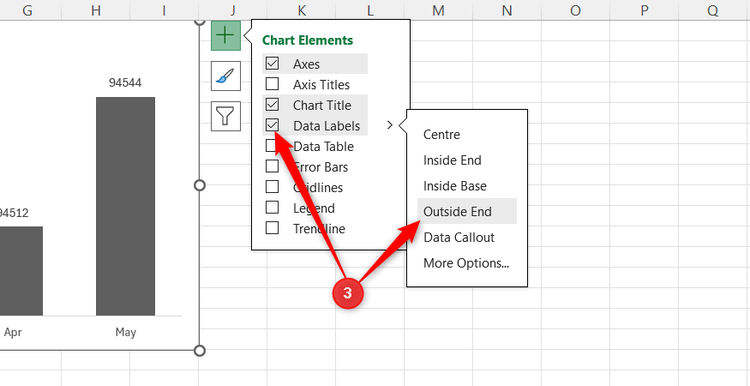
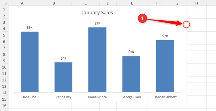
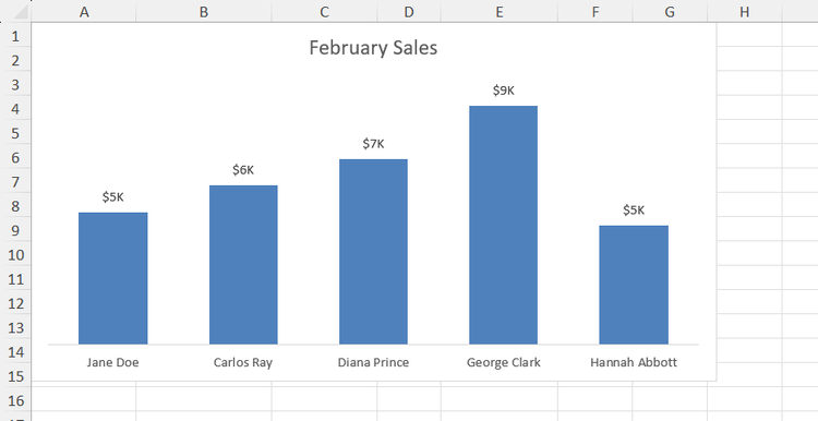
Apply text labels directly to data series
For straightforward charts with a manageable number of data points, placing exact numbers directly on the columns is a great way to make the graphic instantly readable. However, keep in mind that if your chart has dozens of data points, adding labels can make things more crowded, so only use this step if it works for your dataset.
To add data labels:
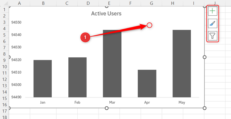
- Click the chart area to reveal the quick access buttons on the right.
- Click the green + icon (Chart Elements).
- Check the box for Data Labels, expand the drop-down menu, and select Outside End.
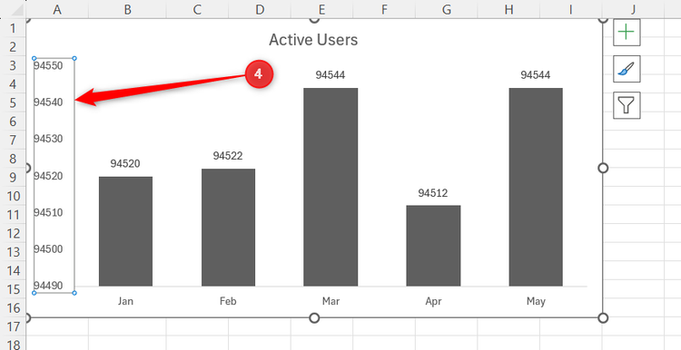
- Now that the labels do the heavy lifting, remove the redundant y-axis numbers by clicking them once and pressing Delete.
![]()
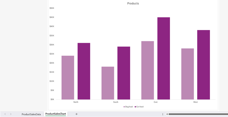
Work in a dedicated chart sheet for cleaner editing
When I’m cleaning up a chart, I usually move it to its own sheet. Having extra space makes formatting less fiddly and lets me focus on the visualization without surrounding spreadsheet data competing for attention. In most cases, I actually leave charts on their own sheets even after I’m finished, since it makes the charts easier to read and lets the workbook feel a bit more organized and navigable.
To move your graphic to its own dedicated tab:
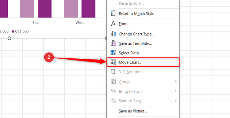
- Right-click the outer border of your chart.
- Select Move Chart from the contextual drop-down menu.
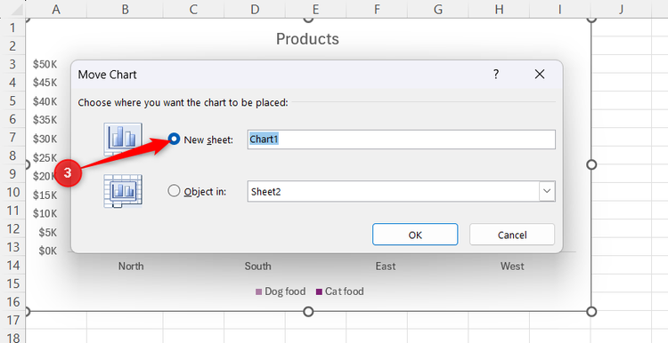
- Check the New Sheet option in the Move Chart dialog.
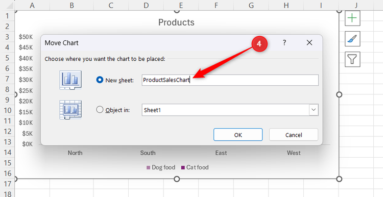
- Give the tab a clear name, then click OK.
Isolating the graphic gives you a full-screen canvas that makes precise visual adjustments much easier to manage.
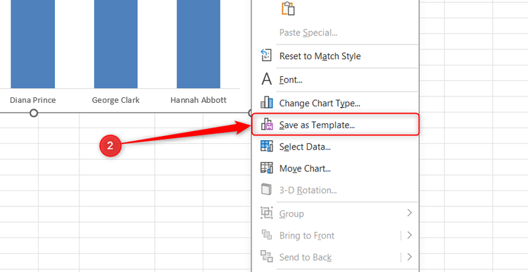
Save your final design as a reusable preset
There’s no reason to repeat these manual adjustments every single time you need to build a graphic. Once you have customized a chart layout you genuinely like, you should save it as a reusable template.
To create your new default style template:
- Right-click the outer border of the polished chart.
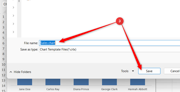
- Select Save as Template from the contextual menu.
- Name the file something clear and recognizable, then click Save.
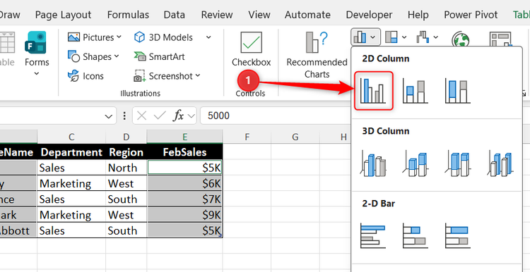
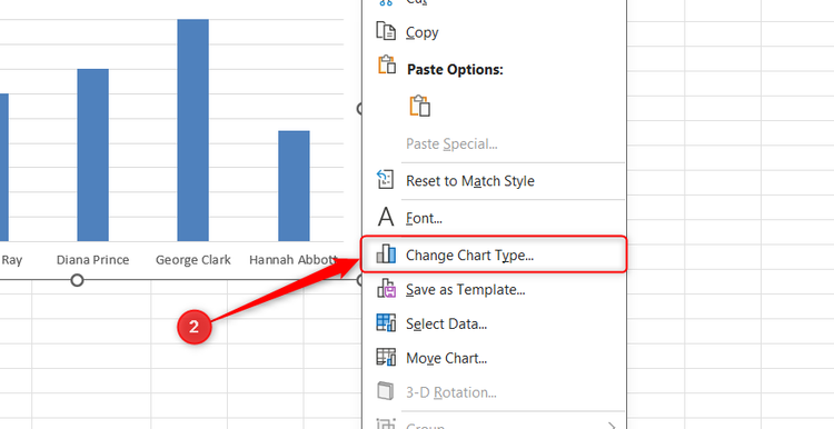
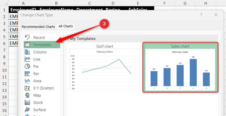
Then, to use your saved template on a new chart:
- Select your data, click Insert, and create a standard chart.
- Right-click the border of the new chart and select Change Chart Type.
- Open the Templates folder, select your saved template, and click OK.
The chart snaps straight into your pre-determined style.
Leave A Comment?