When Apple released iOS 26 in September 2025, it introduced the new Liquid Glass design overhaul, which adopts translucent elements throughout the system interface and in stock apps. iOS 27, available now, builds on Liquid Glass by refining the visual effect to make contents more readable and the interface more consistent, but the overall style remains the same.
On the Home Screen, the search bar, dock, and app folders are translucent. By default, app icons have a layered glass look that gives them dimension, but there’s also an option for “Clear” glass-like icons. This setting turns your app icons transparent, and widgets too. So if you want the full glass effect, read on.
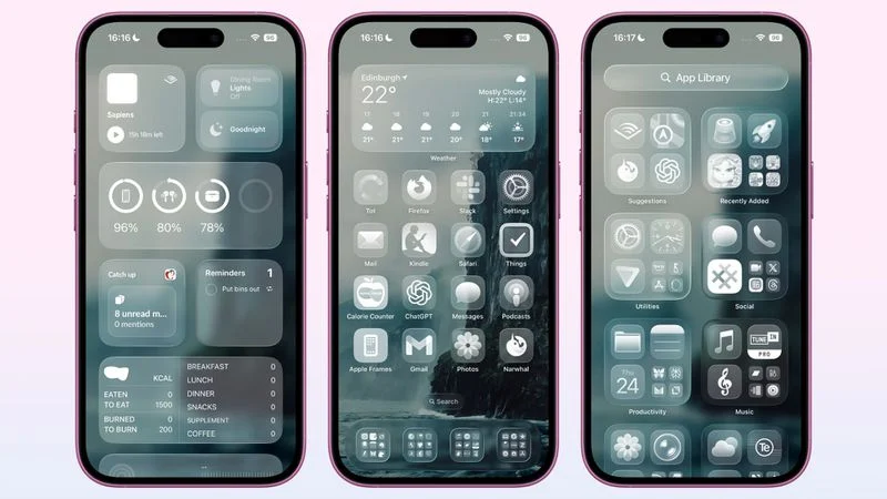
In iOS 18, Apple introduced Dark Mode and Tinted app icons. With iOS 26 and iPadOS 26, Apple added a third visual style – Clear – which removes the color from app icons and widgets, and applies reflective, translucent effects to make them appear see-through.
There are two versions of the Clear style. In Light mode, app icons appear semi-transparent, subtly darkening the wallpaper beneath them. Both icons and widgets resemble glass-like panels with layered text and images. In Dark mode, icons retain some transparency but feature a darker background, making them more pronounced while preserving the layered, translucent aesthetic.
How to Get Clear App Icons in iOS 26
[mai mult...]