Situatie
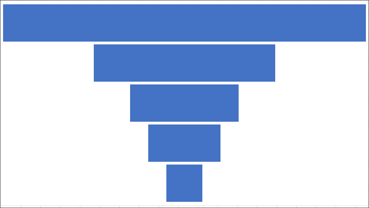
A funnel chart is great for illustrating the gradual decrease of data that moves from one stage to another. With your data in hand, we’ll show you how to easily insert and customize a funnel chart in Microsoft Excel.
Solutie
Pasi de urmat
Open your spreadsheet in Excel and select the block of cells containing the data for the chart. Head to the Insert tab and Charts section of the ribbon. Click the arrow next to the button labeled Insert Waterfall, Funnel, Stock, Surface, or Radar Chart and choose “Funnel.”

The funnel chart pops right into your spreadsheet. From it, you can review the data and as mentioned, see the largest gaps in your process.

The best place to start when editing your chart is with its title. Click the default Chart Title text box to add a title of your own.

Next, you can add or remove chart elements, choose a different layout, pick a color scheme or style, and adjust your data selection. Select the chart and click the Chart Design tab that displays. You’ll see these options in the ribbon.

If you’d like to customize the line styles and colors, add a shadow or 3-D effect, or size the chart to exact measurements, double-click the chart. This opens the Format Chart Area sidebar where you can use the three tabs at the top to adjust these chart items.

Once you finish customizing your chart, you can also move it or resize it to fit nicely on your spreadsheet. To move the chart, simply select and drag it to its new spot. To resize it, select it and drag inward or outward from an edge or corner.

Leave A Comment?