Situatie
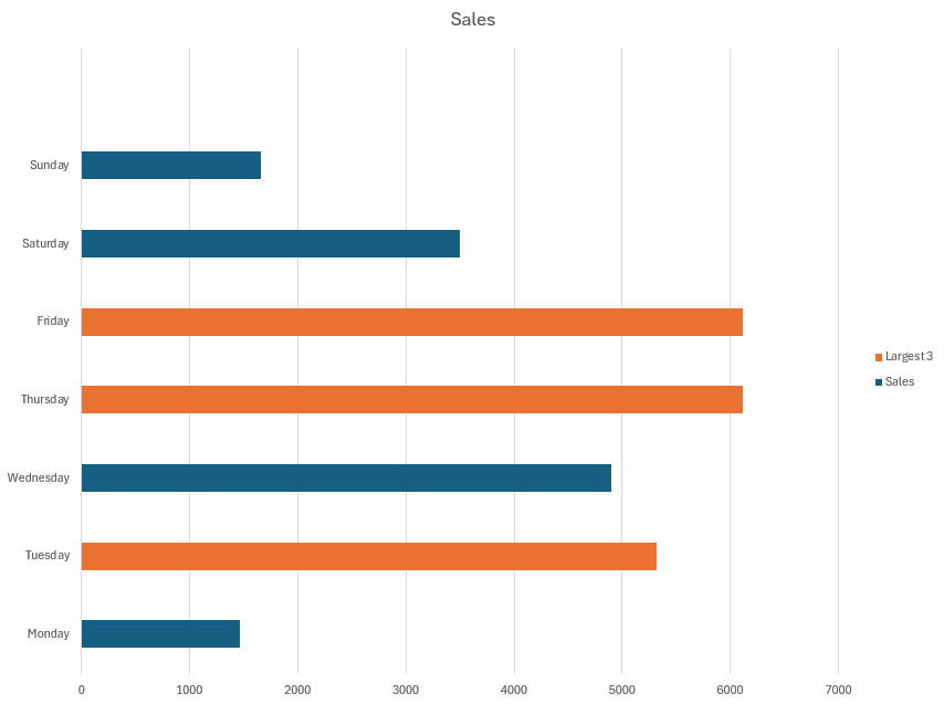
If you have a chart in Excel and want to emphasize the highest or lowest values in a way that changes with your data, changing them to a different color is the most effective method.
Solutie
Step 1: Prepare Your Data
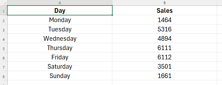
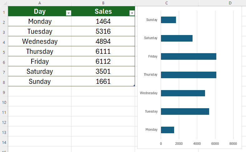
Start by creating your Excel table. As we run through the steps, we’ll use a simple sales table with the day of the week in column A and total sales in column B.
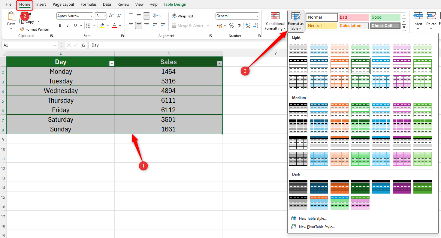
Next, select all the data, and click “Format As Table” in the Styles group on the Home tab. Then, choose a design that works for you. As you can see, we’ve chosen a simple green design.
Step 2: Create Your Chart
Now, you can create the chart for your table. Select all the data in your table (including the header row). Then, in the Insert tab on the ribbon, head to the Charts group, and open the chart drop-down selector.
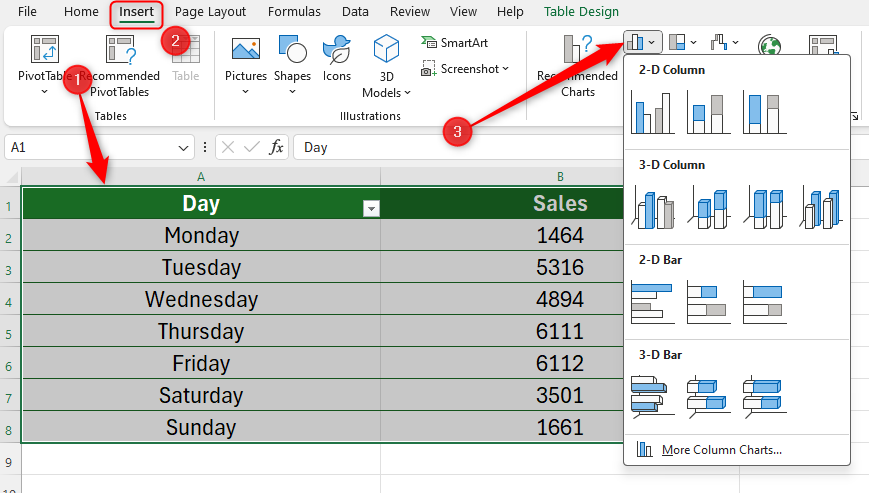
For our data, we’ve chosen a 2D clustered bar chart.
Step 3: Add an Additional Column for Your Parameters
You could stop there, as you have a nicely-presented chart showing your data. However, we want the chart to automatically highlight certain values, which is especially useful if you have lots of data, and you want certain numbers to stand out.
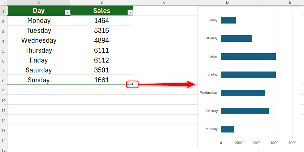
So, the next step is to add an additional column to your table to create the values that you want to be highlighted in your chart. To do this, move your cursor over the handle in the bottom-right corner of your table (your cursor will change to a two-way arrow), and click and drag it to the right.
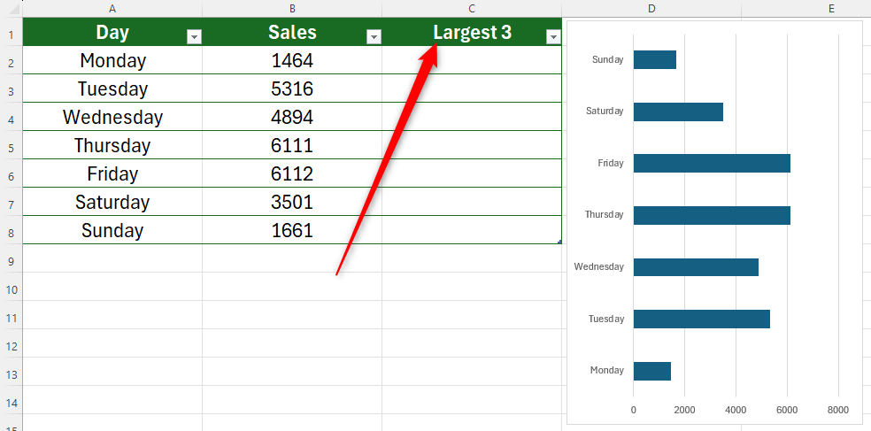
You will see a new column appear, which you will need to name according to what data you want to highlight in your chart. In our example, we want to highlight the three largest values.
Step 4: Extract Your Parameters
We’re now ready to use a formula to tell Excel what data we want to extract from our table.
In the first cell under the new column’s header, you’ll need to use a combination of the IF function and the LARGE function. Here’s the syntax:
=IF(a>=LARGE([b],c),a,””)
where
- a is the cell reference you want to compare to the rest of the data,
- b is the column containing all the data you are comparing (the square brackets tell Excel that we’re referencing the name of a column in a formatted table), and
- c is the total number of high or low values you want to extract.
Bear with us—this might seem confusing, but let’s break the formula down to see how it works.
In cell C2, we start by using the IF function to tell Excel that we are looking to make a comparison between values in our table.
=IF(
We first want to tell Excel that we’re looking to compare the value in cell B2 with the rest of the data.
=IF(B2
In our case, we want to see if cell B2 is a larger value within the series, so we add the > (larger than) symbol.
=IF(B2>
We now need to tell Excel that we’re going to evaluate whether the value in cell B2 is one of the largest values in the Sales column. Take care when typing your brackets, and remember to embed the header name of the column containing your data in square brackets.
=IF(B2>=LARGE([Sales],
Now, specify how many values you want to extract. In our case, we want to see if B2 is one of the three largest values in our data.
=IF(B2>=LARGE([Sales],3),
Next, we want to tell Excel to extract the value into our third column if it is, indeed, one of the three largest within the array.
=IF(B2>=LARGE([Sales],3),B2
Finally, if the value we’re evaluating is not one of the highest three values, we want Excel to return a blank cell.
=IF(B2>=LARGE([Sales],3),B2,””)
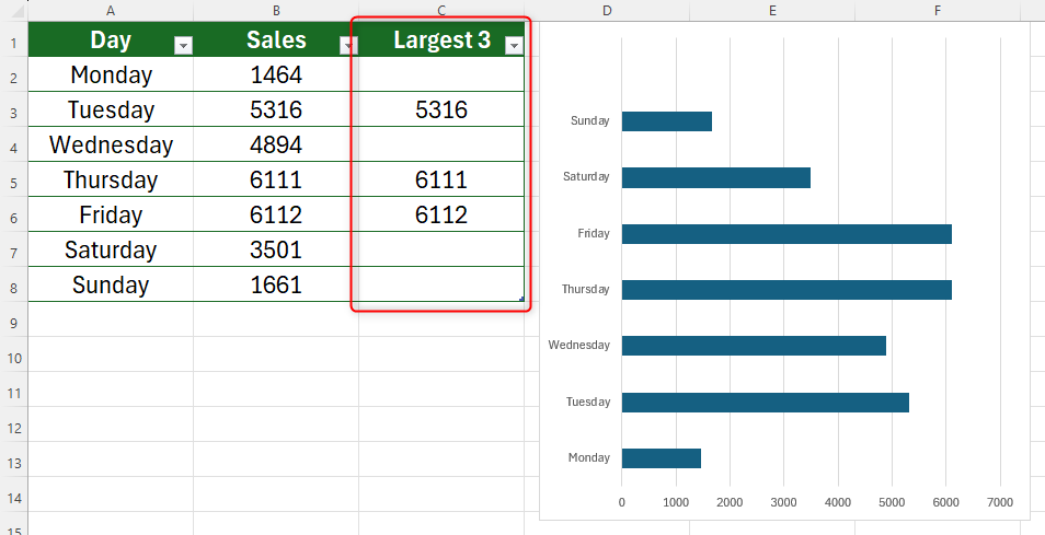
After you have typed your formula, press Enter. If the cell remains blank, it means that it’s not one of the three highest values. If it is, indeed, one of the three highest values, it will duplicate the total where you have just typed your formula.
Excel will assume you want to apply this to all cells in this column and automatically fill the rest in for you. If this doesn’t happen, select the cell containing your formula, and use the handle to AutoFill the rest of the column.
Step 5: Add this Data to the Chart
Now that you’ve applied your new parameters to your table, you’re ready to add this to your chart.
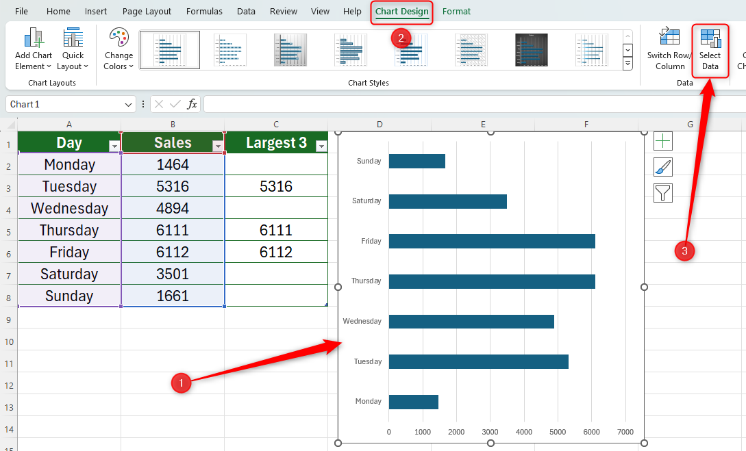
Select the chart, open “Chart Design” on the ribbon, and click “Select Data.”
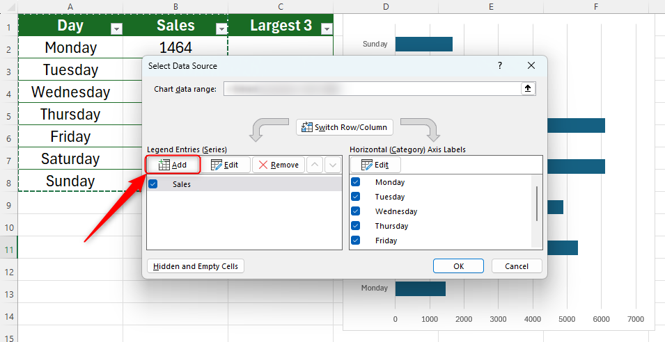
In the dialog box that opens, click “Add” under Legend Entries to add new data to your chart.
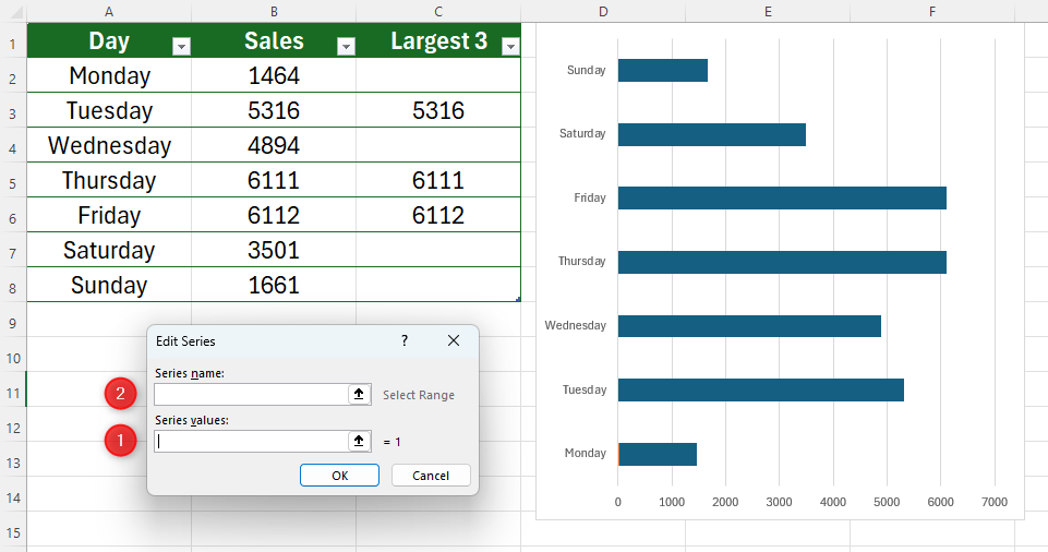
In the Edit Series window, you will see two fields to complete. First, clear both fields of any information they already contain. Now, click the empty Series Values field box and select the new data range you created in step 4.
In our case, we would highlight cells C2 to C8. Then, click the Series Name field box and select the table header for the new data range. In our case, we would select cell C1 (Largest 3). It might seem strange completing the bottom box before the top box, but this is important, because Excel won’t let you give your data range a name until you’ve told it where the data is.
You will then see the outcome in your graph, with an extra bar appearing next to each of the three largest values.
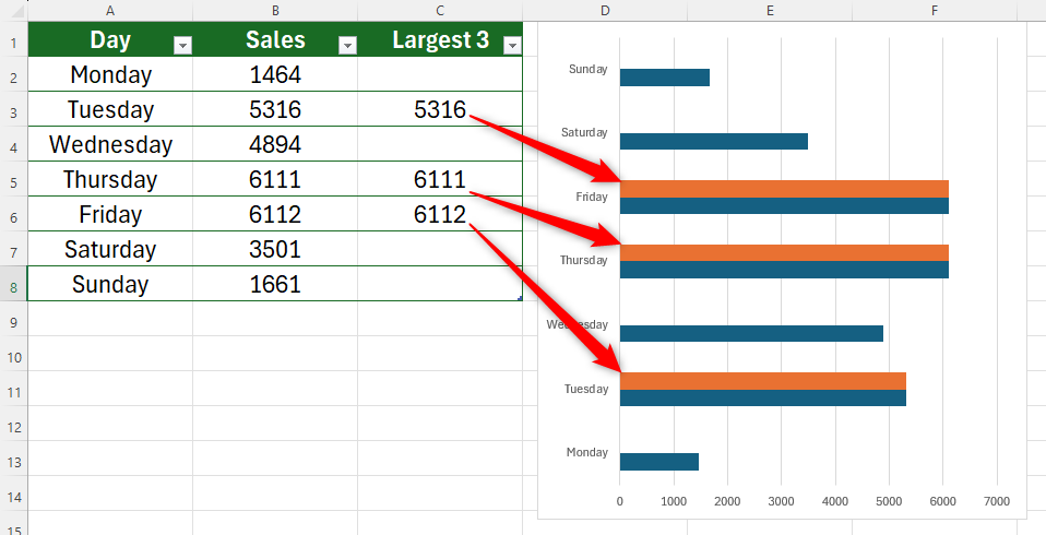
The final step is to make the new series overlap the existing series (that is to say, replace the largest three blue bars with the three orange bars).
Step 6: Overlap the LARGE Series
To do this, double-click any of the newly added bars on your chart to open the Format Series Data pane to the right of your window.
Then, click the drop-down arrow shown in the screenshot below, and click the name of the series you added—in our example, that’s “Series Largest 3.”
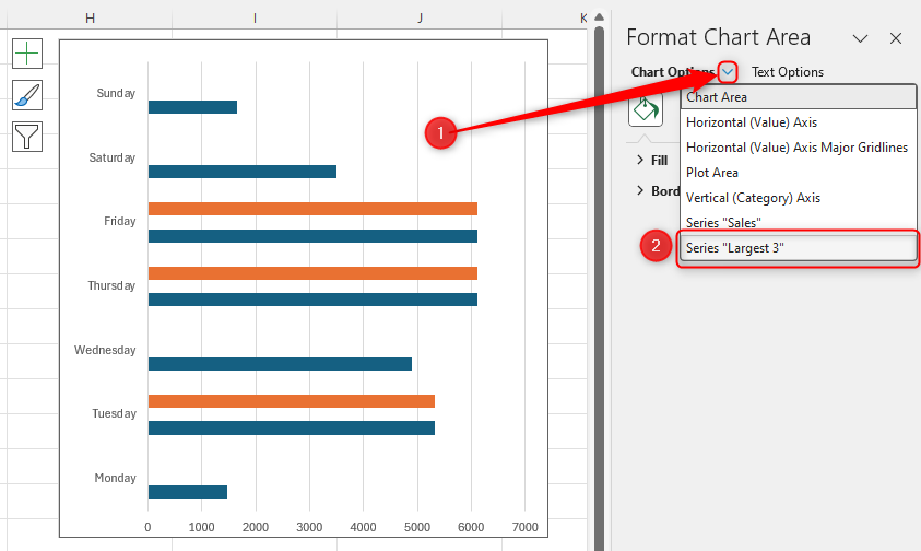
Click the “Series Options” icon, and change “Series Overlap” to 100% by clicking and dragging the slider to the right.
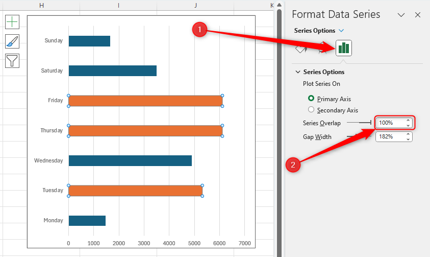
You will now see the final outcome—your chart highlights the max three values in your Excel chart!
You can format the chart to suit your needs, including giving it a title or changing the colors. Right-click anywhere on the chart and choose “Format Chart Area” or “Format Plot Area,” or left-click the very edge of the chart outline and click “+.”
Step 7: Hide the Extra Table Column (Optional)
This final step is optional, depending on how you want your spreadsheet to look.
If you want to hide the additional column in your table that shows the minimum or maximum parameters you have set, resulting in a tidier table, continue reading. If, however, you think you might change the minimum and maximum conditions down the line, skip this step, and head to the bottom of the article.
First, you need to make sure your chart includes data that is contained within hidden cells. To do this, click the very edge of the chart outline, and click “Select Data” in the “Chart Design” Tab.
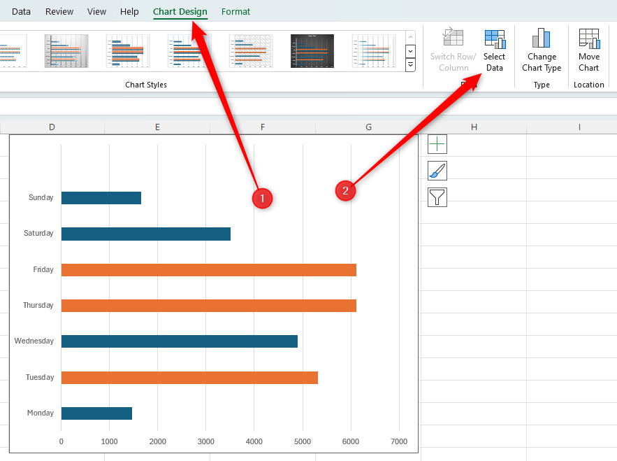
Then, click “Hidden And Empty Cells” in the Select Data Source window, and check the “Show Data In Hidden Rows And Columns” box.
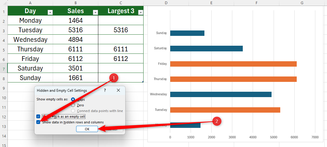
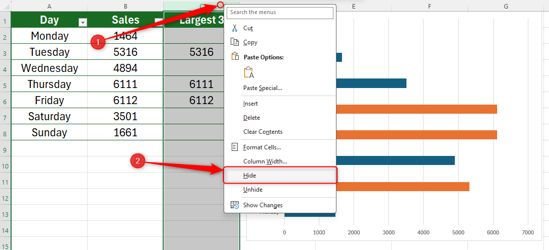
Finally, right-click the column you want to hide (in our case, we’ll right-click the column C header), and click “Hide.”
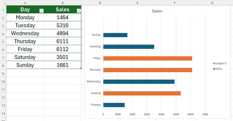
You will then see your table appear as it did when you first formatted it, and the chart maintains the additional color feature you added.

Leave A Comment?