Situatie
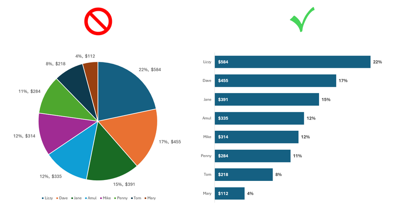
You’ve finalized your Excel spreadsheet and want to visualize your numbers. A pie chart is a tempting option: it takes 20 seconds to create and makes you look sophisticated. However, it often causes more confusion than it solves. To truly impress your coworkers and make your data pop, ditch the circle and build a bar chart that updates itself.
Once you move past three or four slices, pie charts become unreadable, often requiring messy legends and manual labels that clutter the screen. More importantly, even if you sort the underlying data feeding a pie chart, the circular format makes the hierarchy difficult to follow—leaving your visuals in a jumbled mess. By taking the hallmarks of a pie chart and applying them to a dynamic bar chart, you solve all these problems—no legends, no clunky labels, and no confusing order.
Solutie
Step 1: Create a dynamic data bridge
Build a reference table so you don’t touch your source
Before you even touch a chart menu, you need a bridge between your raw data and your visuals to keep your master records clean.
- Select your original dataset (which we’ll call Set A) and press Ctrl+C to copy it to your clipboard.
- Move to a new area of your spreadsheet, right-click, and select Paste Link to create a duplicate (which we’ll call Set B).
- Select Set A, click Format Painter in the Home tab, and select Set B to dupplicate the formatting.
By linking the cells, any update you make to Set A will automatically flow into Set B.
Step 2: Insert and stylize the bar chart
Strip away the Excel defaults for a modern look
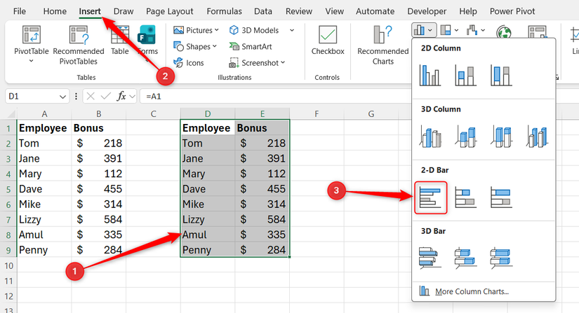
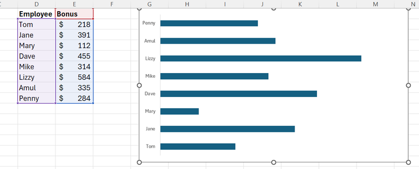
Now that you’ve prepared your linked data, you can insert a bar chart and strip away the unnecessary clutter that Excel adds by default. Select Set B, and in the Insert tab, choose a Clustered Bar Chart.
Since you’re going to add value labels directly to the bars, you can delete the gridlines, chart title, and horizontal axis to remove the visual noise.
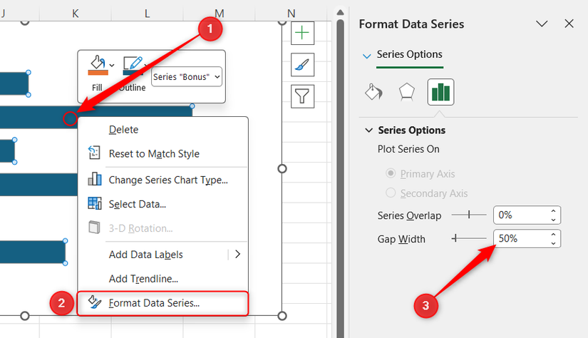
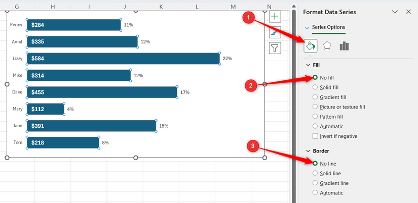
Next, right-click a bar, select Format Data Series, and change the Gap Width to about 50% to create thicker, more professional-looking bars.
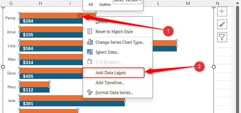
Now, right-click a bar again, but this time, click Add Data Labels.
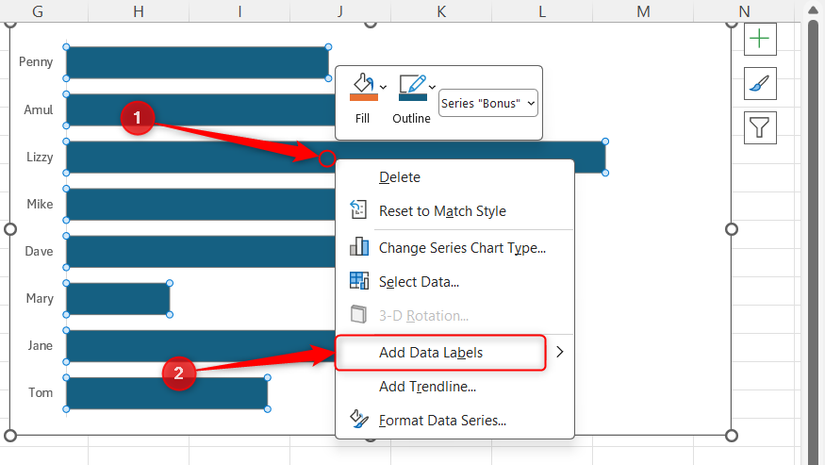
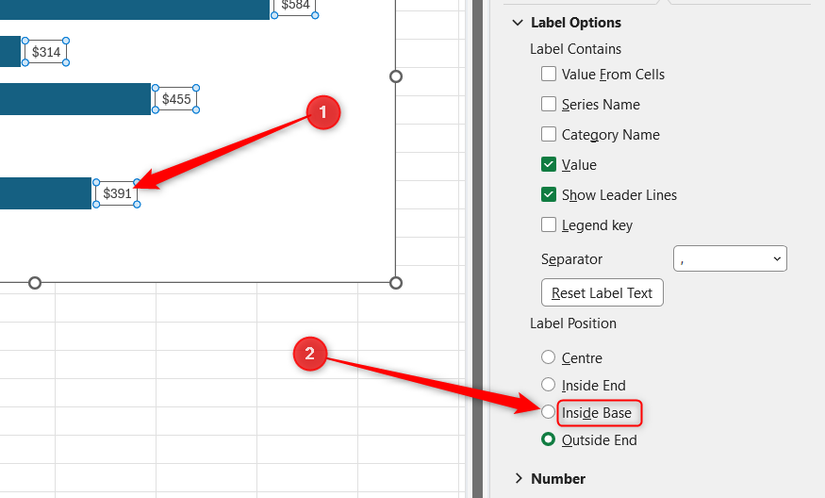
Click one of the new data labels once to select them all, press CTRL+1, and in the sidebar, toggle Inside Base.
Step 3: Execute the dual label percentage hack
Overlay a ghost series to show the whole picture
This step mimics the “contribution to total” label that people like in pie charts. You can do this by layering a secondary, invisible series over your bars.
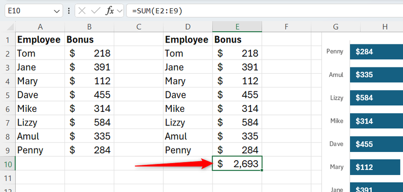
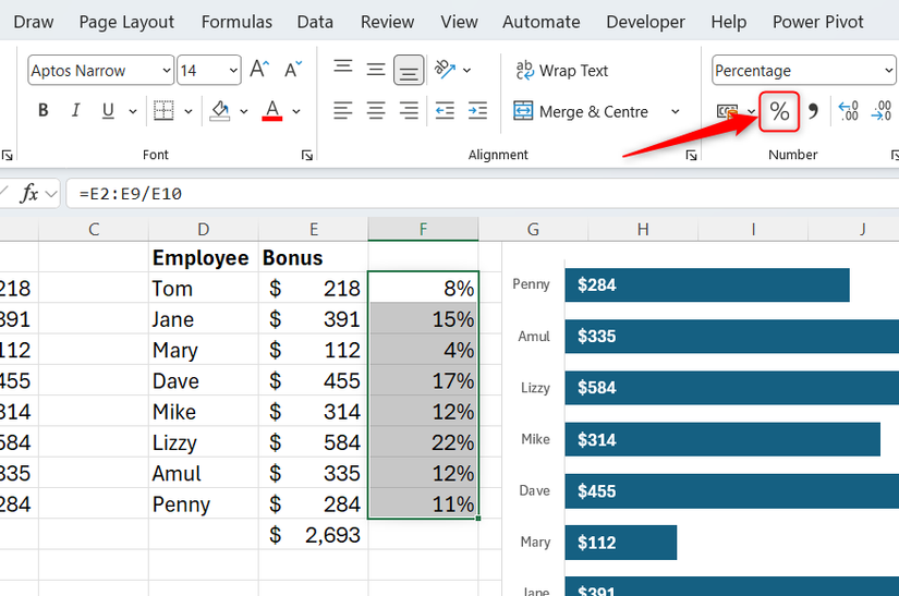
First, select the cell directly beneath the value column in Set B, and press Alt+= then Ctrl+Enter to create an AutoSum total for your values.
Now, in the first cell of a new column directly next to Set B, type this formula, and press Enter to spill the result downward:
=E2:E9/E10
In this case, the values are in cells E2:E9 and the total you just created is in cell E10, meaning you’re dividing each regional value by the overall value.
If you’re not using a version of Excel that supports spilled ranges, type =E2:E9/$E$10 into the first cell, and click and drag the fill handle to the bottom.
Then, select and format that new range as a Percentage by clicking the % icon in the Number group of the Home tab.
Next, right-click your chart and click Select Data.

In the Select Data Source dialog, click Add.
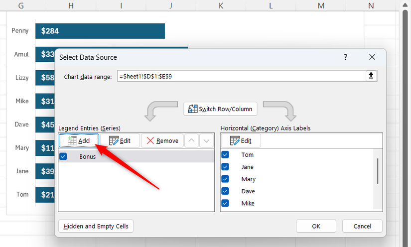
In the Edit Series pop-up, name the series Percent, link this series to the values in Set B, and click OK.

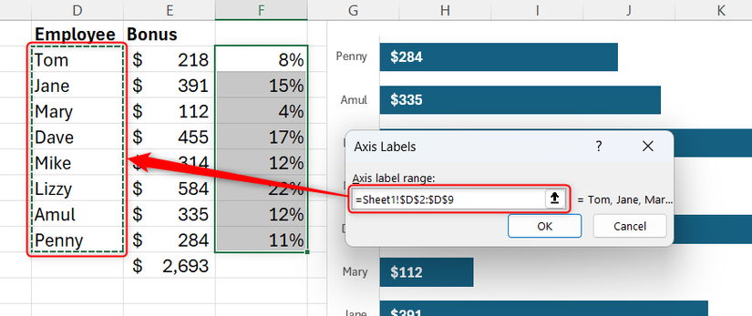
You also need to amend the Horizontal labels, so click Edit for this category.
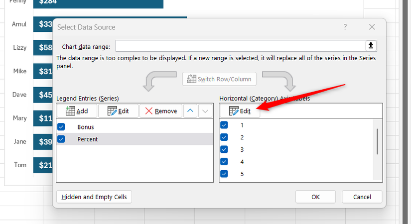
This time, link to the labels in Set B and click OK.
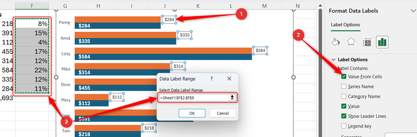
When you close the Edit Series dialog, you’ll see that the second series is layered in the chart. Right-click one of these new bars and click Add Data Labels.
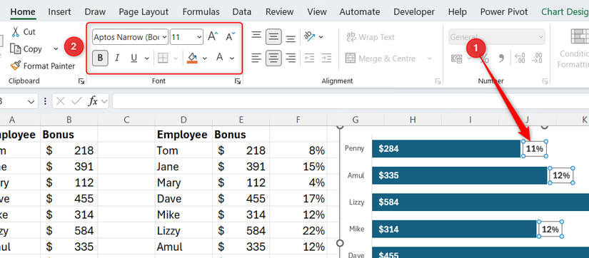
Now, with the new data labels selected, press Ctrl+1, check Value From Cells in the sidebar, and select the percentage values as the label range.
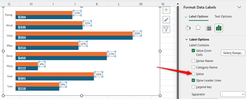
When you click OK, you’ll see that both values and percentages are displayed for this series, so uncheck Value in the sidebar to show only the percentages.
To stop there being two bars for each entry, select the new series in the chart, and in the sidebar, change Series Overlap to 100%.
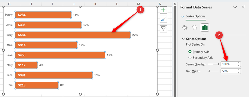
Because the two series are now overlapping, click the paint pot icon in the sidebar, and select No fill and No line.
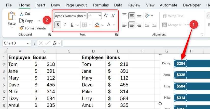
For the final part of step 3, select the percentage data labels, and use the Font group of the Home tab to format the text so that it aligns with the formatting of the inside labels you set up earlier.
Before you move on to step 4, take a moment to change some values in Set A. When you do this, the values in Set B will adjust accordingly, the percentages will update, and the chart will reflect these changes.
Step 4: Automate the sort order
Use the SORT function to keep the winner at the top
Now that the chart contains everything you had in your pie chart—category names, exact currency values, and total contribution percentages—but without the clutter, you could stop there. However, to elevate your bar chart further, you can force it to place the bars in descending order, so that the highest value is at the top and the lowest value is at the bottom.
Select the data in Set B, and press Delete. At this point, the bars in your chart will disappear, and your percentage and total calculations will break, but don’t worry—they’ll come back after the next part.

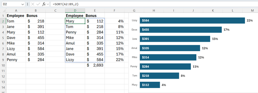
In the top-left cell where Set B was previously, use the SORT function to pull the data from Set A in order. In my case, I’ll type:
=SORT(A2:B9,2)
into cell D2, where A2:B9 is the range containing the data in Set A, and 2 tells Excel to sort by the second column of this range (the values). Even though the table is sorted in ascending order, the chart will show the highest value at the top because of how Excel handles the Y-axis. Now, the chart is much easier to read.
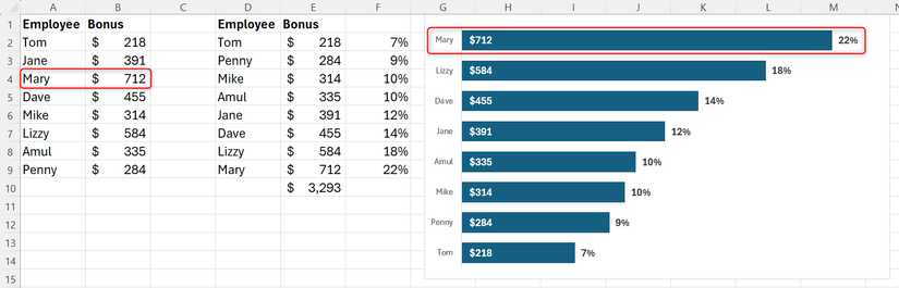
Suppose Mary’s figure is incorrect. Rather than receiving a bonus of $112, she actually receives a bonus of $712. When I update this value in Set A, she jumps to the top of my chart, and all the values and percentages adjust to this change.
Leave A Comment?